
Categories
Brand Identity
Packaging Design
Motion Design
The Overview
Prismatic Lotus
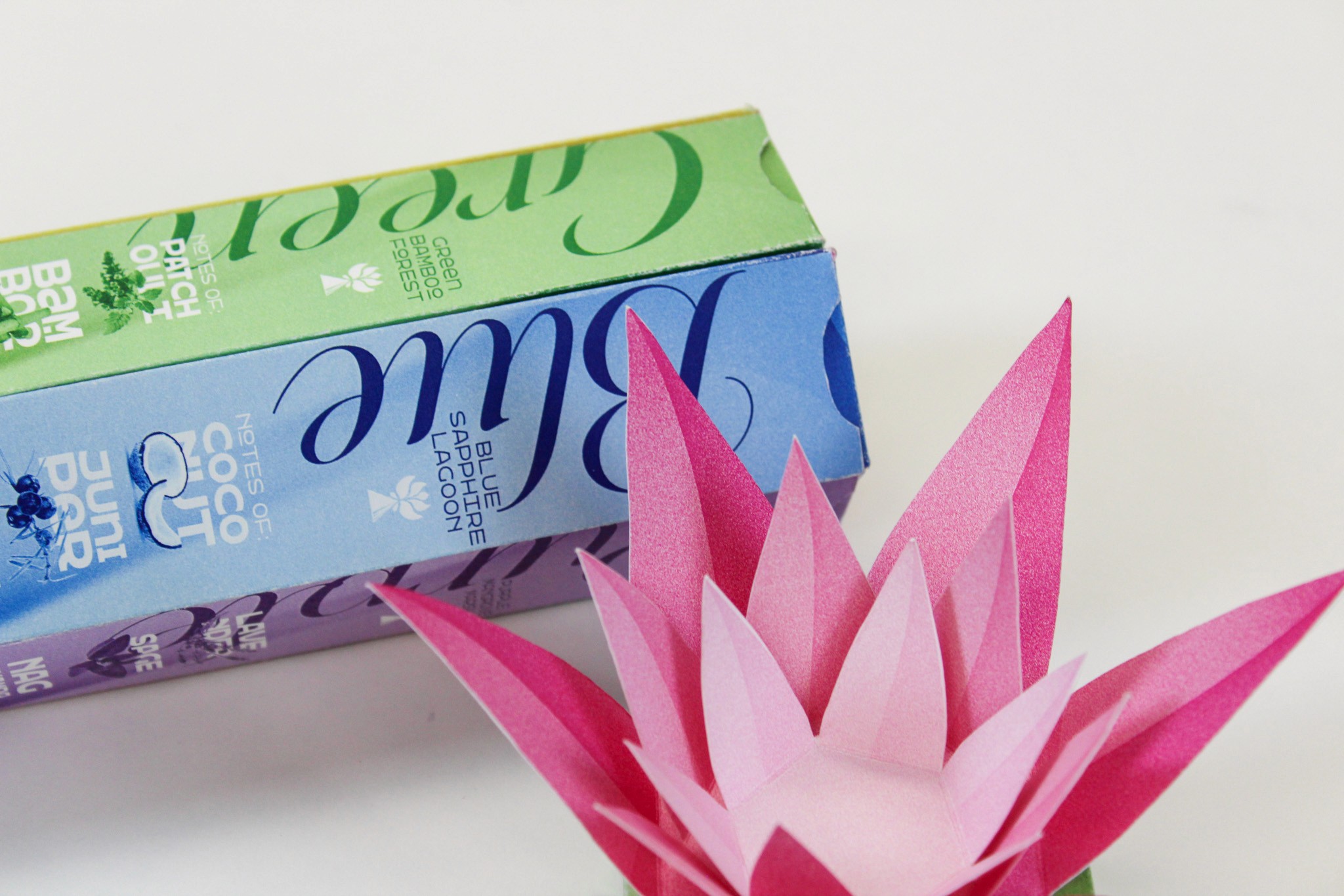
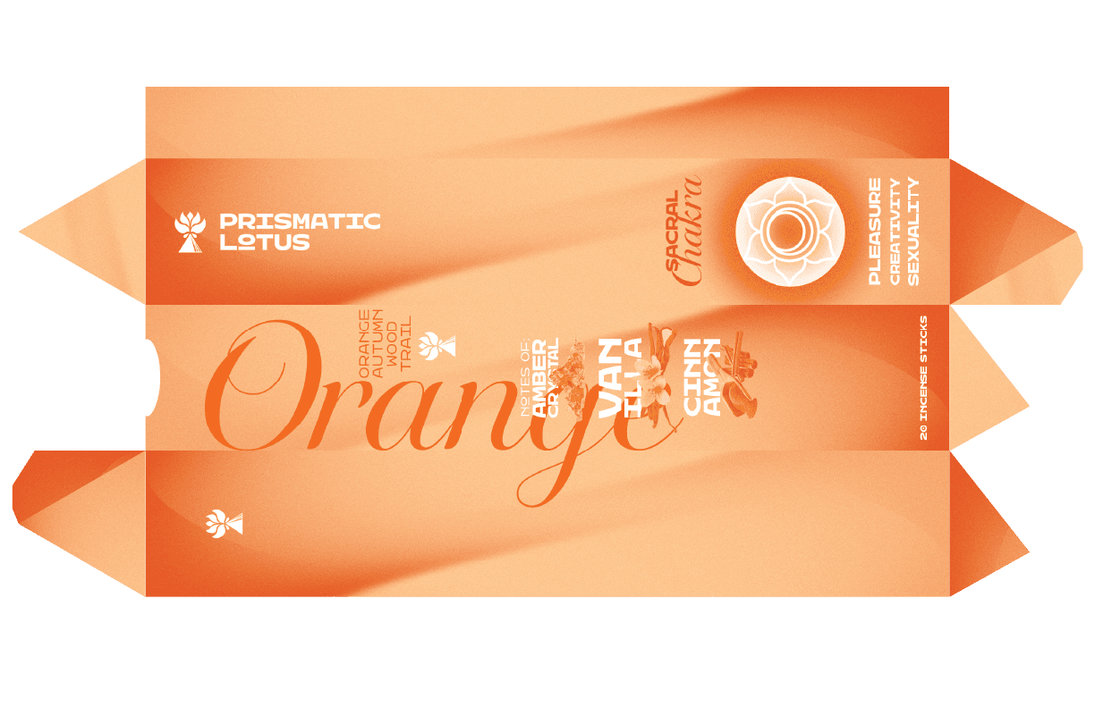
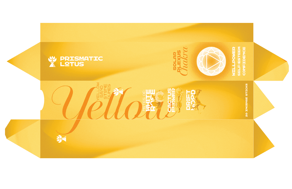
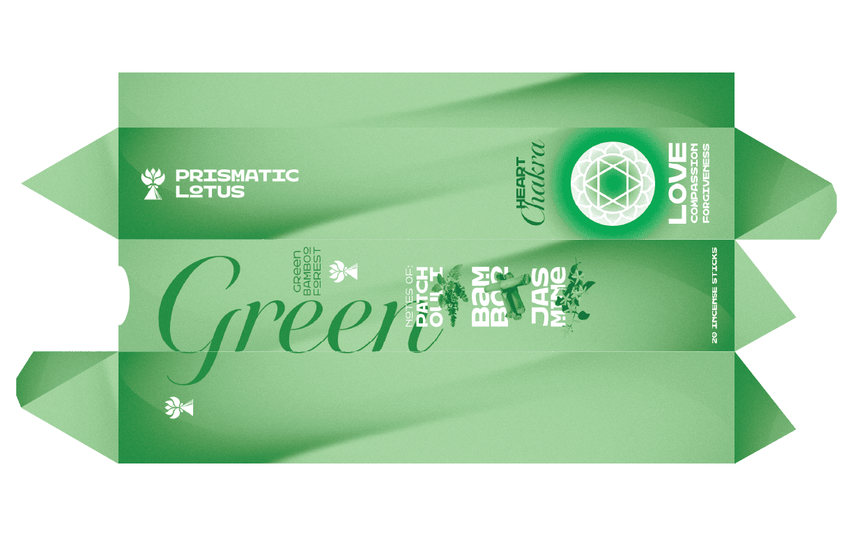
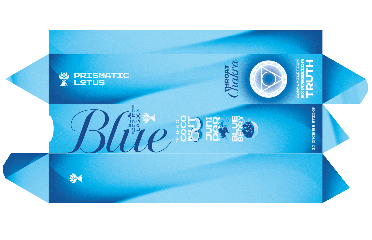
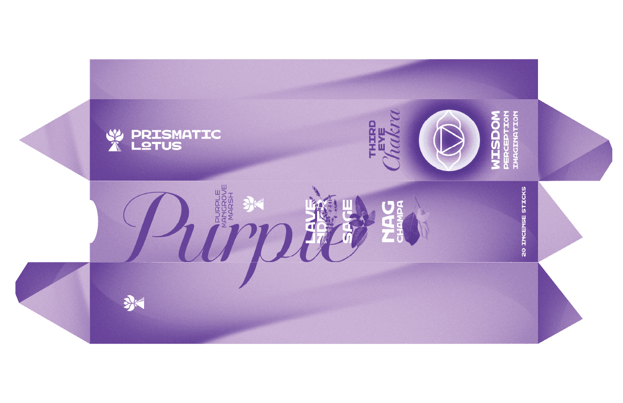
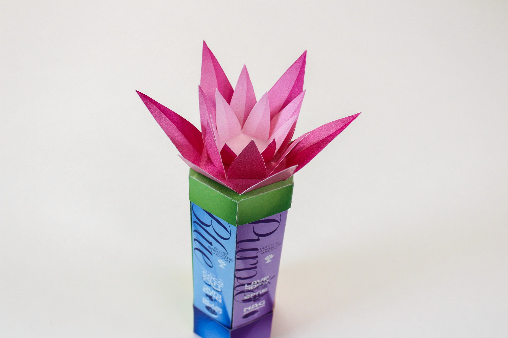
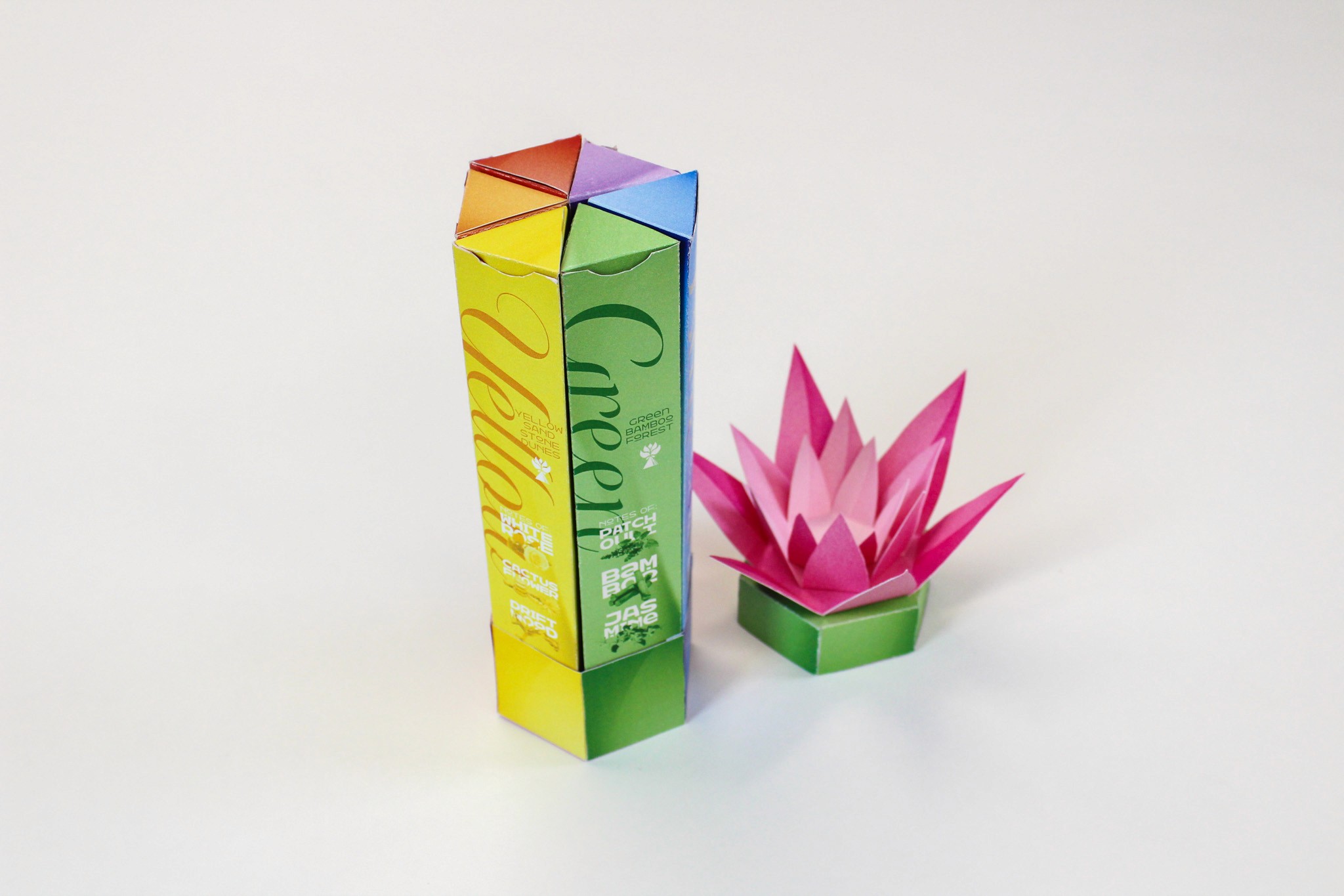
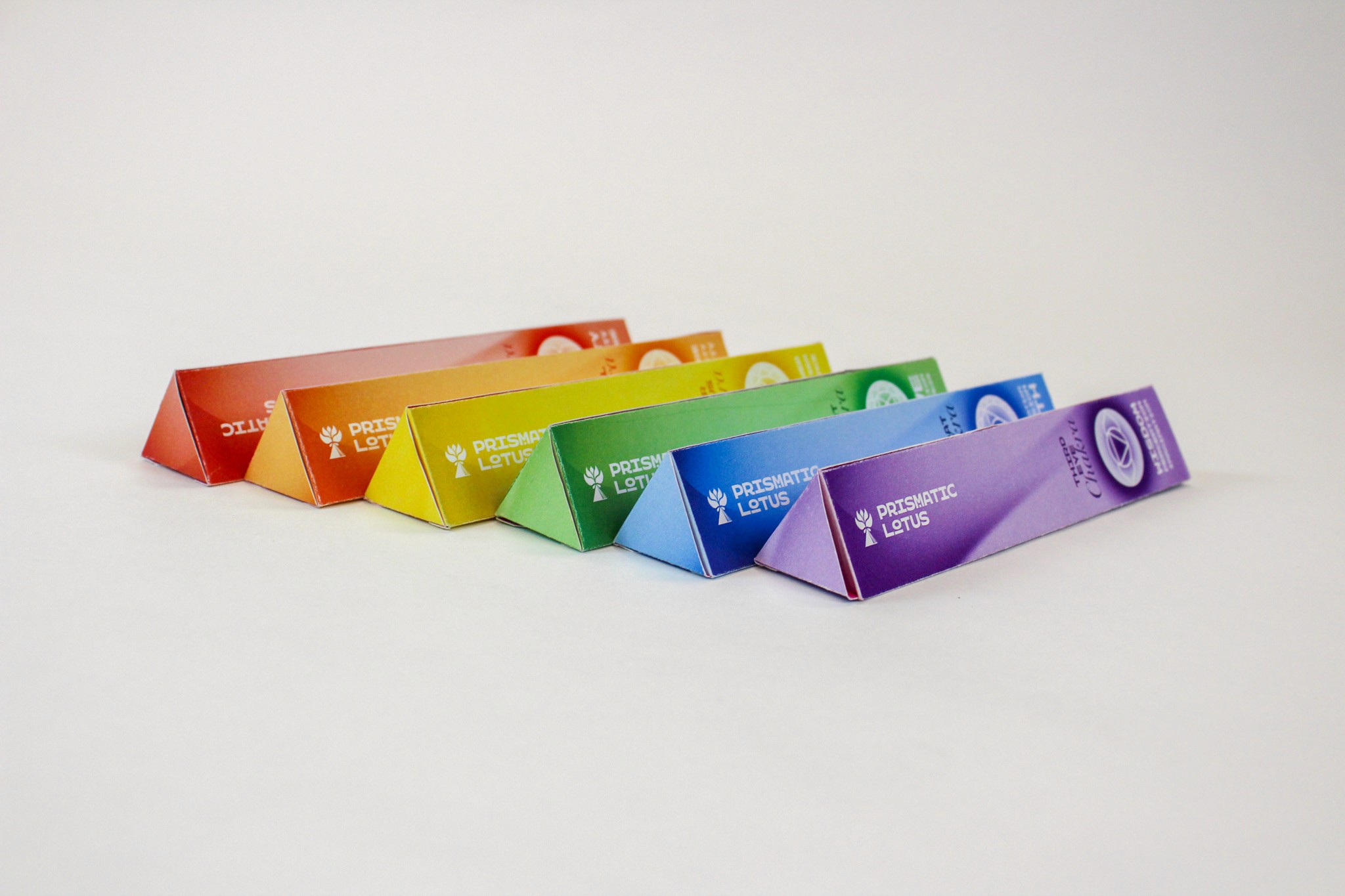
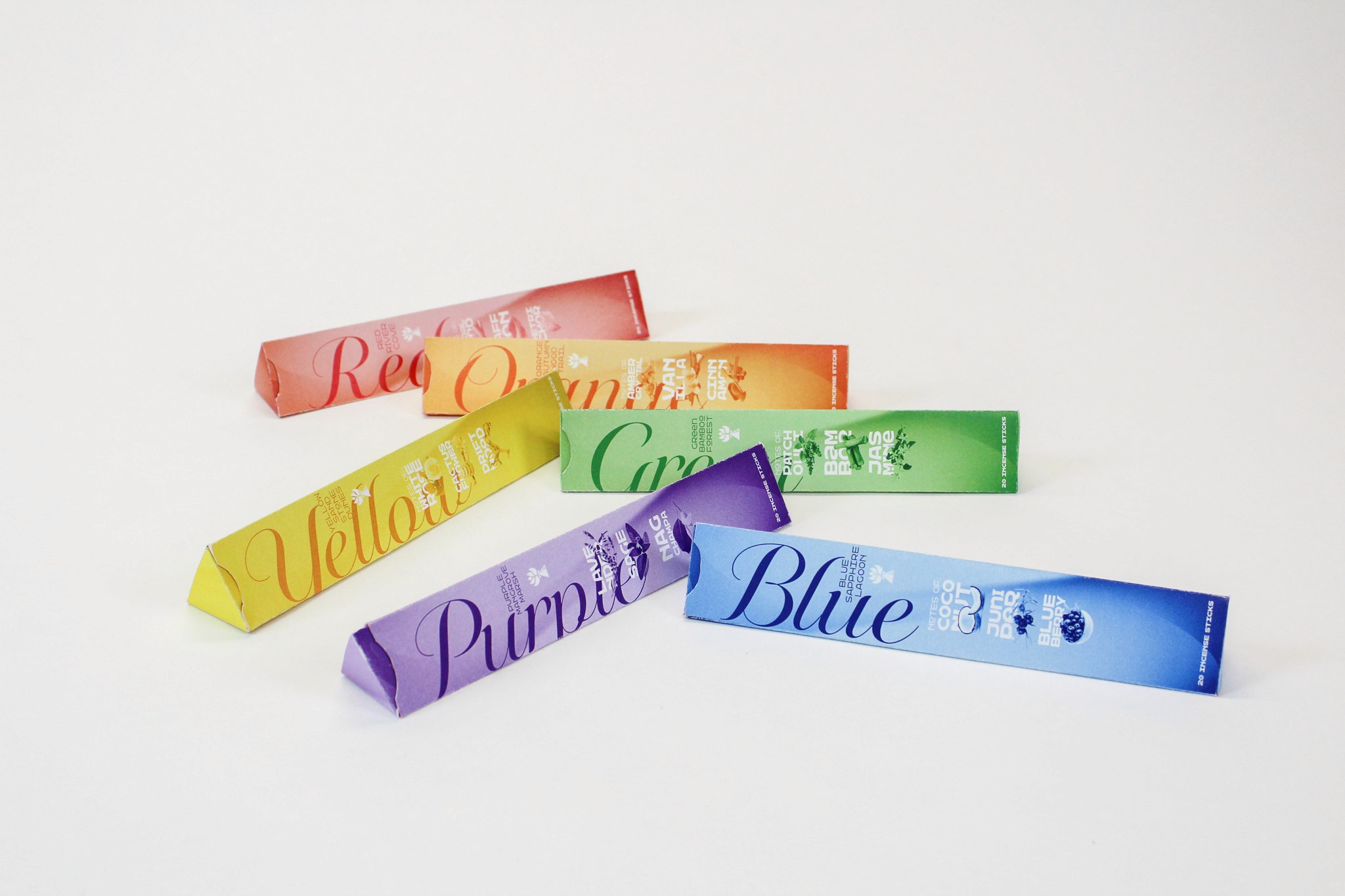
For this project we were tasked to create packaging that either solved an issue with it’s form / function or create packaging that resembled a fruit / flower. I decided to create an incense brand inspired by the lotus flower that consisted of six different scents that transported you to their own whimsical realm. Each section is based off of a color of the rainbow and was held together by a top and a bottom themed to the lotus flower. The brand is meant to feel like something you would find in one of those mystic crystal shops in especially gentrified cities across the US
The Timeline
March-May 2025
The Flats
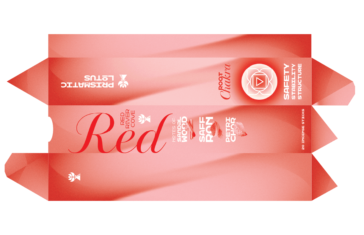
Individual Box Flats


Top and Bottom
Lotus Flowers
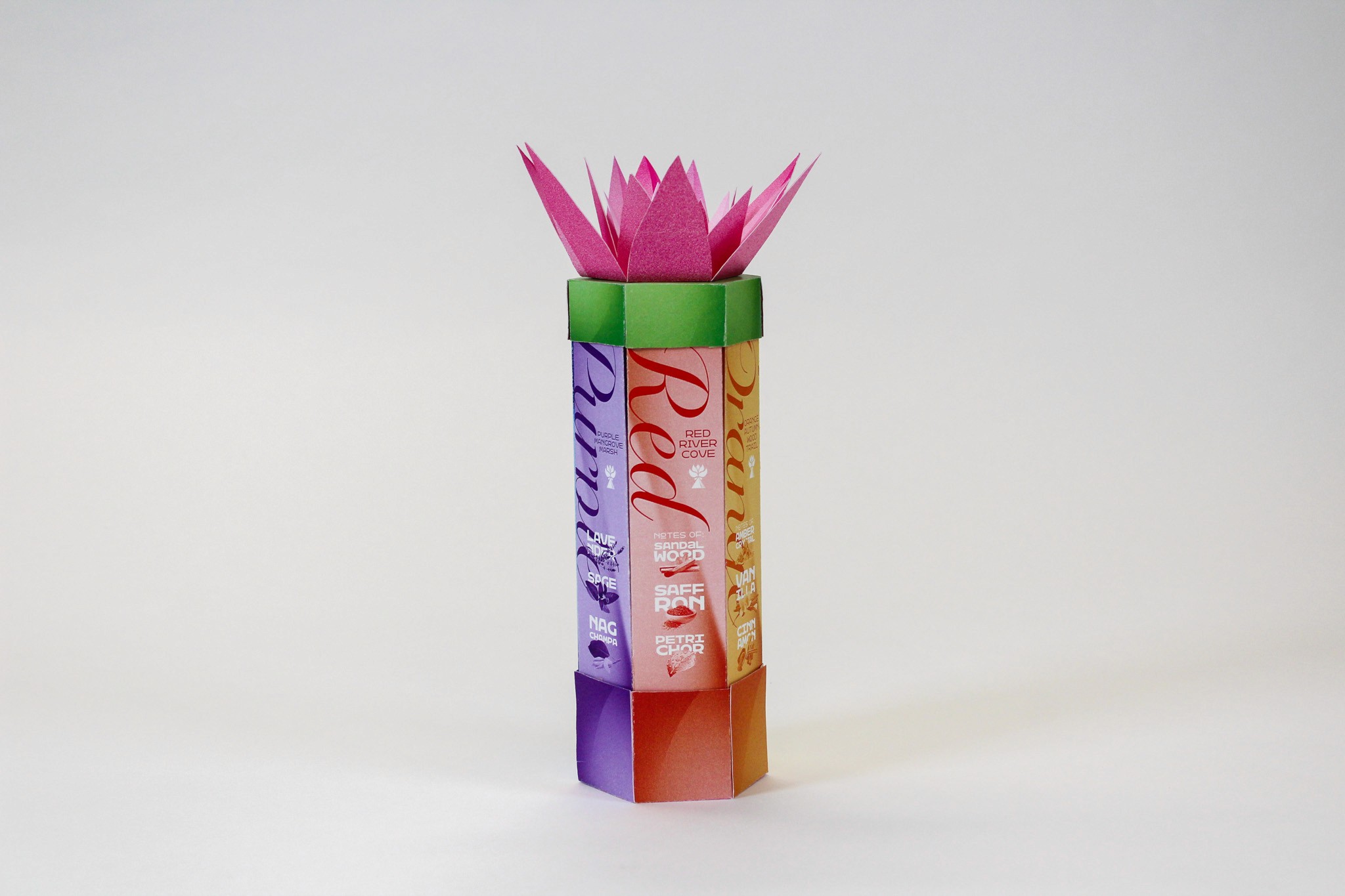
The Product
The Story
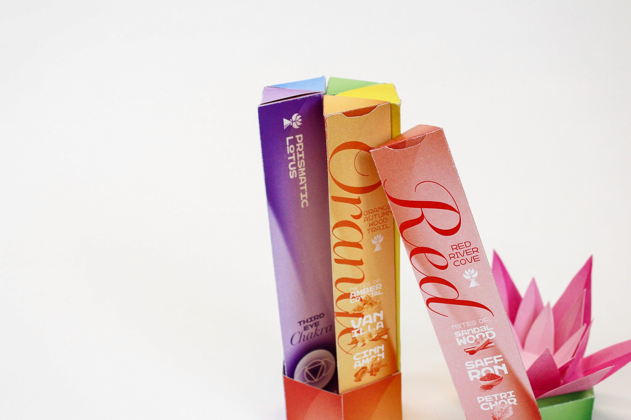
Prismatic lotus is the cross section between healing and euphoria. Our brand strives to transport our users to planes of existence yet unknown through aromatherapy and good vibes. Prismatic Lotus is not just an incense brand, it is an experience. With our unique packaging and otherworldly scents we aim to bring a world of whimsy to each of our customers homes. Our packaging isn’t meant to be tossed, it’s meant to be displayed, cherished, and most importantly used. Each package is made with love and each stick of incense is adorned with positive energy making any space smell good and feel good to be in.
Just like how a prism separates light into a spectrum of colors, Prismatic Lotus transforms our chaotic world into a place of whimsy and positivity.


